 Search Tips
Navigation button
This article discusses the navigation button: its functions and variations.
The navigation button has two important functions. Firstly, with the use of different colours and icons, it provides a visual indication (or reminder) of the configured interaction mode: swipe, or tap-only — see Table 1.
Secondly, when activated (tapped by the user's finger), it performs a navigation function, depending on context and activation duration:
-
a short press opens the function card preview;
-
a long press opens the status and settings menu.
The status and settings menu on the REM400 or REM500 is not accessible when connected to a LiNX Access programming tool (PC or iOS), — that is: the status and settings menu does not display with a long press of the navigation button.
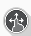
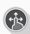
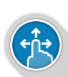
The navigation button's appearance varies according to the configured interaction mode (swipe or tap-only) and its status. When in swipe mode, an icon with a finger and three arrows is displayed; in tap-only mode, an icon with a finger and a circle is displayed. These icons change colour, from grey to blue, when activated. This is summarised in Table 1.
Table 1 - navigation button
|
Inactive navigation |
Indication |
Active navigation |
Indication |
|---|---|---|---|
|
Swipe mode |
|
Responding to a |

|
Tap-only mode |

|
Responding to a |

|
Screen lock active |
|
|